| “Compare Peak Picking” option | peter r mosen | 2021-11-15 07:50 | |||||||||||||||||
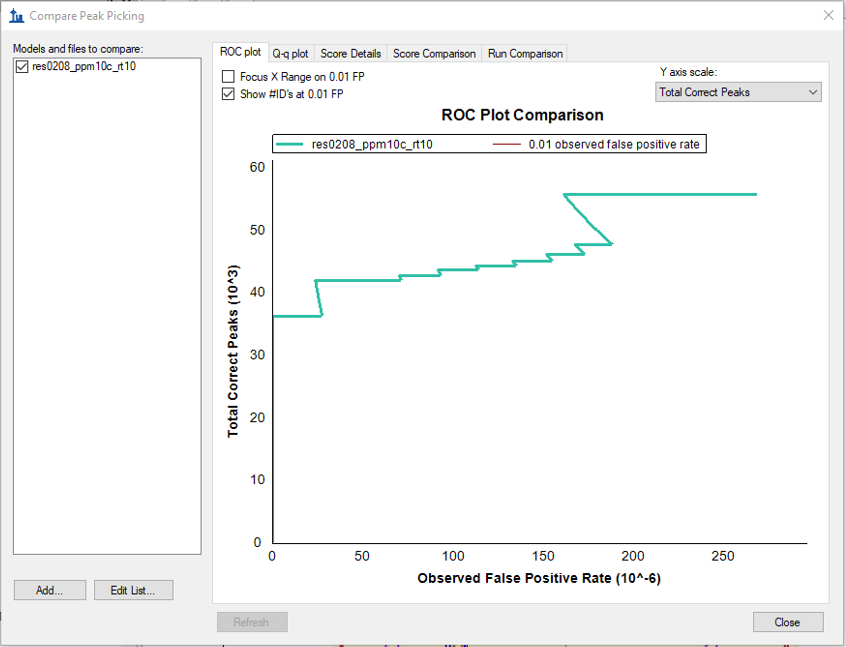
Hello Brendan and Team, my post is linked to a previous issue of mine (Comparing Peak Scoring, 2021-06-17). I am still struggling with the “Compare Peak Picking” option. I acquired my MRM-data (400 peptides light and corresponding 400 heavy standards), built customized peak scoring model(s) using the 2nd best peak option and applied the models to my data. Peak scoring models (p- and q-value distribution) look good and q-value based refusal of peptides corresponds well with results from manual inspection. For comparison of the built models I want to use the ROC plots. And here my doubts start: a) If I load my peak scoring model specific to the dataset (here CIL, which are isolated organelles), no ROC curve is visualized at first (slide1) To doublecheck I loaded DIA sample data from webinar 15 (slide4) and re-used the model you built. Also here the ROC curves for your model have this unusual shape. Maybe you guys can comment on this. What am I doing wrong? I didn’t find any documentation/tutorial on this. FYI: I am using Skyline alpha (64-bit) 21.1.0.146 |
|||||||||||||||||||
| |||||||||||||||||||
 JaggedRocPlot.PNG