Linwei,
Thank you for sending me the rest of those files.
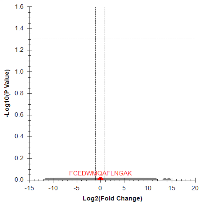
The reason that your volcano plots look the way that they do is that the p-values of the group comparisons really are very close to 1.
With a group comparison, a low p-value such as 0.05 would mean that there was a significant difference between the two groups, whereas a p-value close to 1 means that there is no observable difference between the two groups.
The p-value comes from a Student's T-test, and it measures the variance within the two groups is much less than the variance between the two groups.
When I look at the Peak Area Replicate Comparison graph, I see that this is huge variation within the two groups that you have defined ("DMSO" and "JC19"), and it is much larger than the variation between the two groups, and therefore you get a p-value which is close to 1.
The Group Comparison tutorial is a great way to learn about this feature in Skyline:
https://skyline.ms/wiki/home/software/Skyline/page.view?name=tutorial_grouped
-- Nick
 data extract plot.png
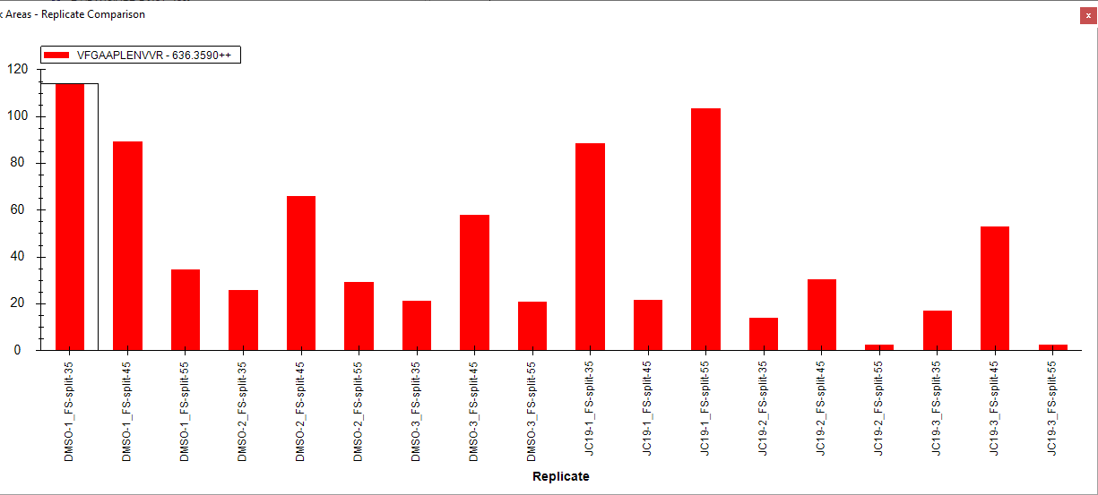 PeakAreaReplicateComparison.png